Graphic Design with the 1960s • Lesson 1
GRAPHIC DESIGN OF THE '60s
🕰️ Time Travel to the 1960s!
1 class period
Pop-Art Name Tag
Paper + Colors
Photo + Reflection
By the end of this lesson, you will:
✅ Describe how Design Thinking is used in art and graphic design
✅ Create a '60s style Pop-Art name tag
In the 1950s and 1960s, artists realized there was a new group of customers: young people. They wanted bright, bold, and affordable art. Through prototyping and testing, artists found a solution: Pop-Art. That is Design Thinking: try an idea, test it, then improve it.
Learn how Pop-Art began to meet the needs of young customers in the '50s and '60s.
🎨 MATERIALS: Paper, pencil, and something to color with (markers, crayons, colored pencils)
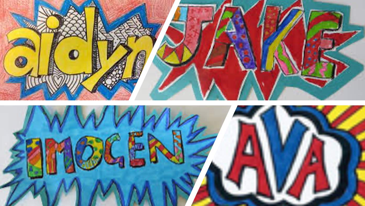
💥 POW! SUBMIT YOUR POP-ART! 💥
📸 Take a webcam photo of your name tag
💬 Answer in the comments:
"I made my name tag look like Pop Art by using ______, which makes it feel ______."
STYLE CHOICES:
bright colors • bold outlines • comic font • opposite colors • Ben-Day dots • patterns • thick letters
FEELINGS:
bold • exciting • fun • energetic • eye-catching • vibrant • retro • loud • playful
Al final de esta lección, podrás:
✅ Describir cómo se usa Design Thinking en el arte y diseño gráfico
✅ Crear una etiqueta de nombre estilo Pop-Art de los años '60
En los años 1950 y 1960, los artistas se dieron cuenta de que había un nuevo grupo de clientes: los jóvenes. Querían arte brillante, llamativo y económico. A través de prototipos y pruebas, los artistas encontraron una solución: Pop-Art. Eso es Design Thinking: propones una idea, la pruebas y la mejoras.
Aprende cómo comenzó el Pop-Art para satisfacer las necesidades de los jóvenes en los años '50 y '60.
🎨 MATERIALES: Papel, lápiz y algo para colorear (marcadores, crayones, lápices de colores)
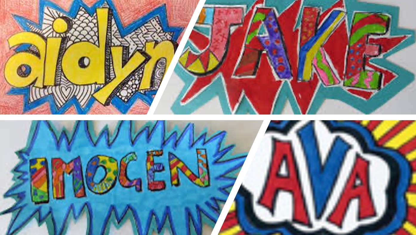
💥 ¡ZAS! ¡ENVÍA TU POP-ART! 💥
📸 Toma una foto con la cámara web de tu etiqueta
💬 Responde en los comentarios:
"Hice que mi etiqueta se vea como Pop Art usando ______, lo cual la hace sentir ______."
OPCIONES DE ESTILO:
colores brillantes • contornos gruesos • fuente cómic • colores opuestos • puntos Ben-Day • patrones • letras gruesas
SENTIMIENTOS:
llamativa • emocionante • divertida • energética • vibrante • retro • audaz • juguetona